
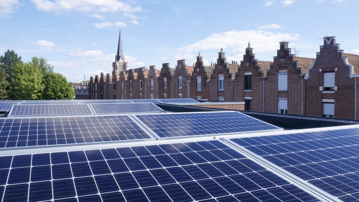

Stunning Visualisation Reveals Europe’s Real-Time Electricity Emissions
An open source project visualises the emissions of electricity generation across Europe along with the potential for renewable energy.
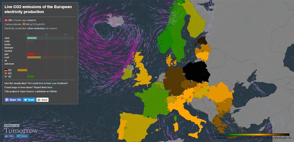
The Electricity Map project has integrated live data feeds into an interactive map of Europe to show how electricity is distributed across the continent, what energy sources are used and how much carbon is being produced to generate it.
Using up-to-date weather data, the tool also shows what the current potential for solar and wind power is in individual countries.
Olivier Corradi, one of the people behind the tool, says he believes “information precedes action” and that you can only decide how to act “when you know what is happening.”
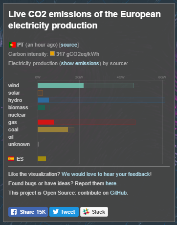 |
| A snapshot of electricity production in Portugal |
Renewables And Nuclear
The live map indicates how much carbon is produced to generate a kilowatt hour of power.
The map shows how France is among the least carbon intensive electricity producers because of its focus on nuclear energy, while Norway is keeping emissions down through hydroelectric power generation.
By playing around with the tool you can discover how wind and solar power have already become a significant part of the energy mix in most European countries.
Coal And Shale
The visualisation also reveals that Poland and Estonia are among the continent’s most carbon intensive electricity users.
By selecting Poland on the map you can see that the country currently heavily relies on coal for power generation. Estonia mostly uses oil shale to produce electricity.
Renewable Potential
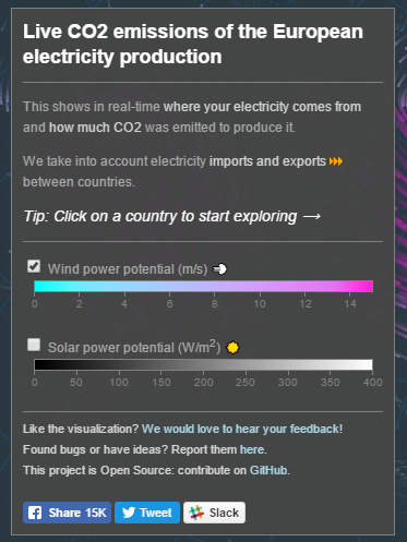 |
The project uses online wind and cloud coverage data to calculate the potential for renewable power generation.
You can turn on spectacular visualisations of wind speed and direction across Europe as well a layer indicating the current cloud cover.
First launched in September of 2016, the Electricity Map is still a work in progress and Corradi is inviting volunteers to help with ideas, feature requests and bug reports via the project’s GitHub or Slackaccount.
The developers are also looking for more data feeds and help with optimising the tool’s code.
Interested in how projects like these could turn into businesses? Find out how Climate-KIC helps aspiring entrepreneurs accelerate in the zero carbon economy.
The post Stunning Visualisation Reveals Europe’s Real-Time Electricity Emissions appeared first on Climate-KIC.
News published on Climate KIC
Consult the source