

New ‘warming stripes’ show urgency of climate action
A new set of visualisations which show the long term rise in temperatures and the urgency of climate action have been published this week by University of Reading climate scientist Ed Hawkins.
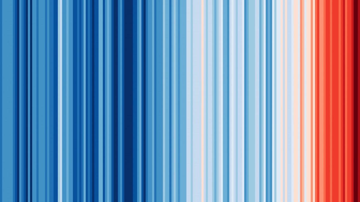
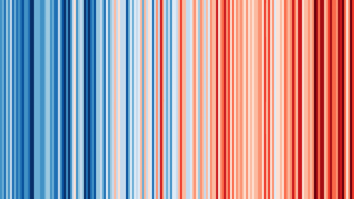
The ‘warming stripes’, which each represent the temperature of a single year, show how global temperatures (above) have seen an increase in temperature of 1.35°C since 1850.
UK, US and Canadian visualisations (below) also show how temperatures were cooler when greenhouse gas concentrations were far lower, but have risen to record breaking averages in recent years
The scientist’s first visualisation, which showed how global monthly temperatures have been increasing spiralling outwards with increased acceleration between 1850 and 2016, went viral, receiving over 15,000 retweets.
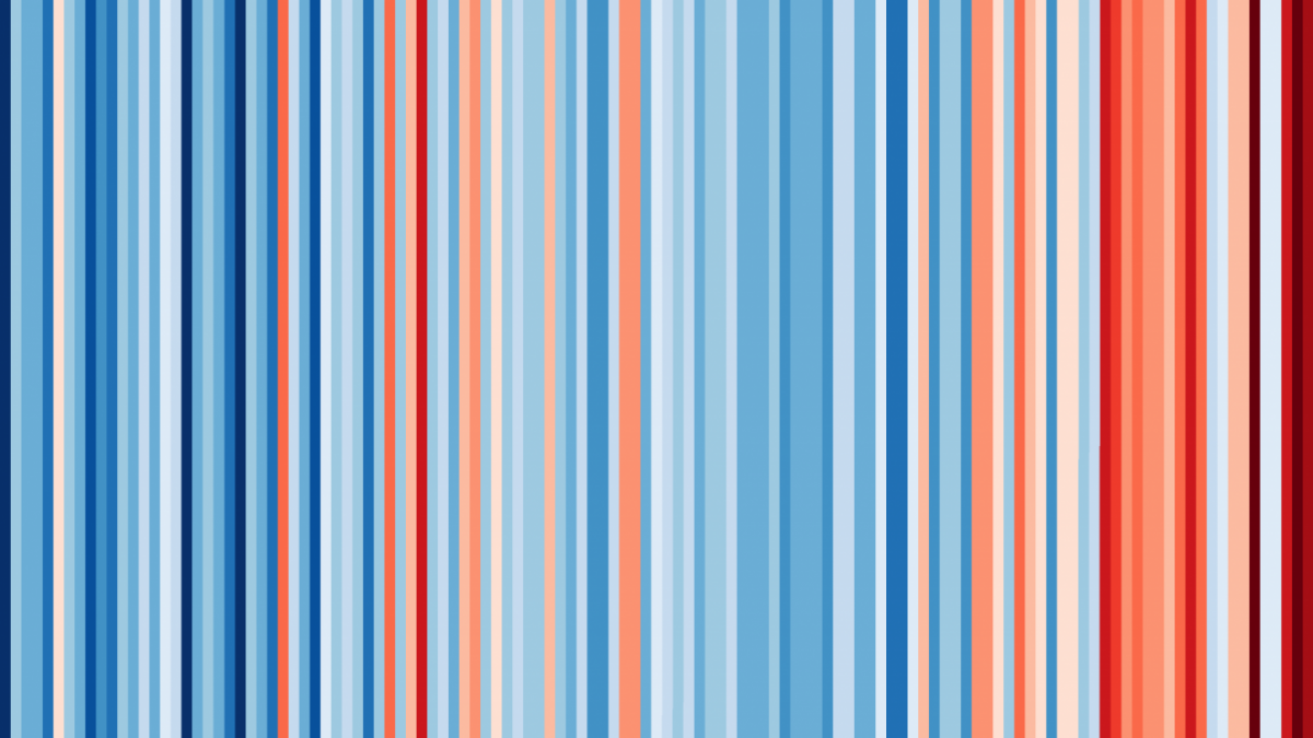
Central England
In central England, average temperatures have risen from 7.6°C (dark blue) in 1772 to 10.8°C (dark red) in 2017.
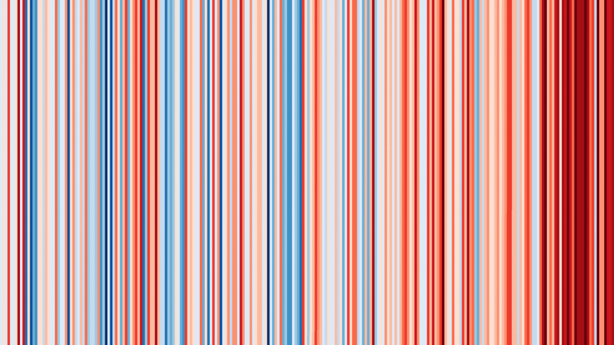
The lower 48 United States
Annual temperatures for the contiguous USA goes from 50.2°F in 1895 (dark blue) to 55.0°F (dark red) in 2017
Toronto, Canada
Annual temperatures in Toronto from increased from 5.5°C (dark blue) in 1841, to 11.0°C (dark red) in 2017.
Other climate scientists have noticed, including Director of Texas Tech University Climate Science Center, Katharine Hayhoe.
Hawkins has plans for to publish the stripes for more locations soon.
Article published by Daily Planet
Consult the source